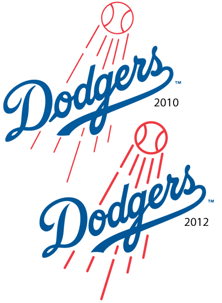
If you didn't, even you're a huge Dodgers fan, don't be ashamed-- very few other people noticed either. In fact, before the days of the internet it's likely no one would have mentioned it for years, if at all. The changes are quite subtle. Back in 2011, SportsLogos.net ran a post titled Dodgers Change Logo, Nobody Notices. Not many people noticed that post outside of the sports uniform blog scene. In only came to our attention today, nearly 2 years later. From the original article:
The major minor-changes involve:
The leading script into the ‘o’ of ‘Dodgers’, it’s there in 2010, it’s gone in 2012.the ‘D’ in ‘Dodgers’ also had a slight change, specifically the curl in the 9-o’clock region of the logo, it’s much shorter in the 2012 edition.the flight lines of the baseball have been corrected.
Not the most necessary change to ever occur but it does tidy the logo up nicely.
As far as we can tell this it the first adjustment of the Dodgers primary logo since their move to Los Angeles from Brooklyn in 1958, that leading tail on the ‘o’ had been around in one-form-or-another since the 1930s.
Perhaps especially because of the fact that it took even the most logo obsessed fans awhile to notice, the ultras over at Uni Watch were intrigued, so much that they landed an interview with the Dodgers Art Director, Ross Yoshida. Here's part of what he had to say:
The most obvious change is the thickening of the ball and streaks and making the line weights uniform. This was done mostly to solve the problem of the red lines getting lost at smaller sizes.
In addition, the Dodgers script was given an overall “refresh”—angles are sharper/cleaner and the script now has a more natural flow (the loop on the D, elimination of the stub on the o, the transition from the g to the e). The end of the underflourish also has an inverted scoop, subtly mimicking the underflourish on our jersey script.
As far as we can tell by searching Uni Watch, there haven't been any other changes since the 2011/2012 season. If you're looking for a comprehensive list of Dodgers' logos, head over to SportsLogos.net's Dodgers page.


