iOS 10.2 is close to a release, and it will include a bunch of new emojis, including an avocado which looks like this:
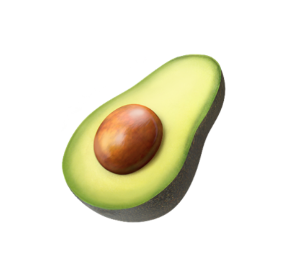
Notice that the look is a bit more detailed and 3D than the current emoji? That's because Apple has redesigned all of their emojis to make them higher quality images with more details, colors, and shading. Part of this includes a total refresh of the taco emoji. Remember our unsuccessful campaign to get Apple and others to make an authentic taco emoji? We're pleased to show you the new taco emoji below...
<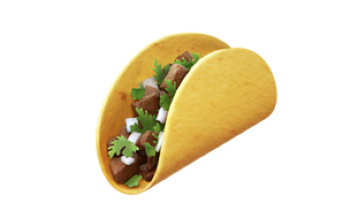
As you can see, it's a real soft corn tortilla, along with cilantro, onion, and (probably) carne asada. It looks delicious, and authentic. Nice work, Apple! Android will hopefully step up to the plate soon and deliver their own improved emoji. We know this is all pretty silly in the scheme of things, but it is still cool that the most famous Mexican food item now has a proper emoji that we can all feel proud of and send to our friends without conflicted feelings. It also means that the taco lifestyle won, and Taco Bell lost.
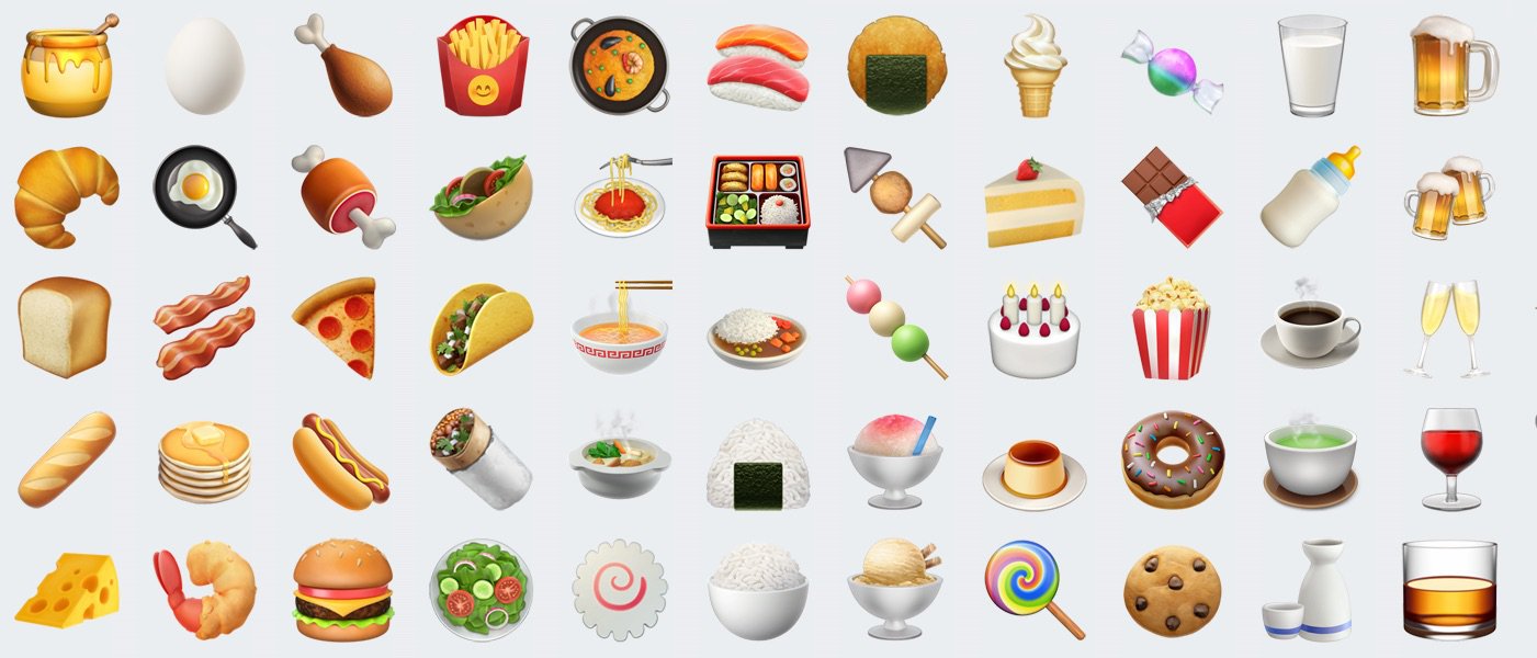
The burrito also got a much-needed facelift. It no longer is some sort of hideous wrap, and is now pretty clearly modeled on the Mission burritos in Apple's backyard, rice, beans, foil and all.

We take back every bad thing we said about Emoji designers, obviously the transition from hard-shell Taco Bell fast-food taco to gorgeously rendered authentic taco wasn't easy to do from an artistic standpoint, but the designers in Cupertino nailed it. For all your Emoji needs, check out Emojipedia. You can see just how far the other companies have to go to reach Apple's new standard.
