Pershing Square was once the heart of Downtown Los Angeles, but a botched remodel turned it into the strange and forbidding hardscape it is today. Thankfully, a movement to remake the square into something better has crystalized into a campaign, which begat a competition which late last month announced four finalists. One of these will become the new Pershing Square and a new chapter will begin in that part of Downtown Los Angeles. You can vote on these proposals, but time is running out!
The finalists vary in their approach to Los Angeles and to urban centers in general, but all of them would be vast improvements over the current location. The organizers of the design competition state:
In September we invited design firms from around the world to compete to be selected as our design partner in re-envisioning Pershing Square, Los Angeles’ oldest park in the heart of DTLA, into the city’s town square. According to our Executive Director: “Their challenge isn’t to win awards; it’s to win over hearts. More than anything else, these groups need to focus on the experiences their design will inspire and the memories the Square will create.”
Perhaps the key line in this statement is the part where they talk about this not being meant for awards. The idea here isn't a beautiful sculpture in the heart of the city, it's a usable place which makes the city more inviting and livable. When we at L.A. Taco think about what the new Pershing Square should be, we think about the peace, tranquility, and an urban adaptability that the best parks have. There is no reason to re-invent the wheel, no reason to innovate for the sake of being different. Parks in New York, Paris, and other walkable cities have been successful using time-honored techniques and design language. Downtown is desperately in need of a classic urban green space, and we used that criteria in ranking these designs, from worst to best...
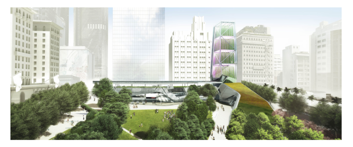
4. SWA | Morphosis
This design is our least favorite, as it calls attention to itself without satisfying many of the basic requirements for the park. While it does a good job of integrating grass, trees, and water, many of the elements come off as not well thought out and possibly gimmicky. The design seems like it will be considered dated within ten years, which is the opposite of what we are looking for in the new Pershing Square. It does not feel like a classic park, but like an attempt to create something new and buzzworthy. While that may be a good approach for another urban space, it is wrong for this one.
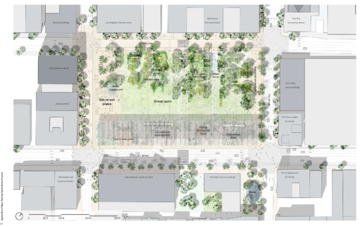
3. Agence Ter and Team
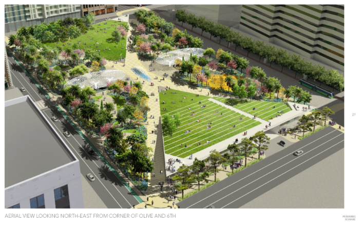
This design suffers by its complete reliance on a giant trellis. Our experience in urban areas is that trellises are difficult to maintain for city workers, are magnets for birds and pests, and easily turn into unsafe areas after dark. The geometry of this design has little mystery; a walk through this park is about avoiding other people, not chance encounters. While the amount and variety of trees is impressive, this feels simultaneously too simple and overly complex-- the interesting parts of the park, which here are called gardens, are buried within the trees. It's hard to imagine them used as interesting and adaptable public space. That said, this design does have its strong points and it fits very neatly into the cityscape.
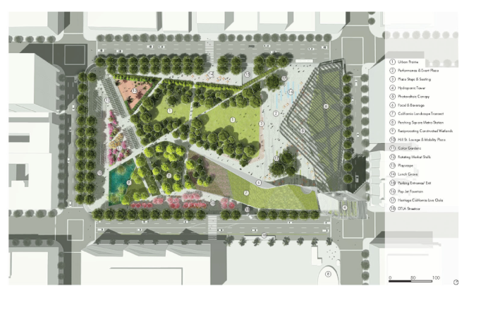
2. wHY + Civets
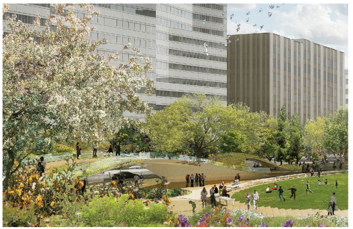
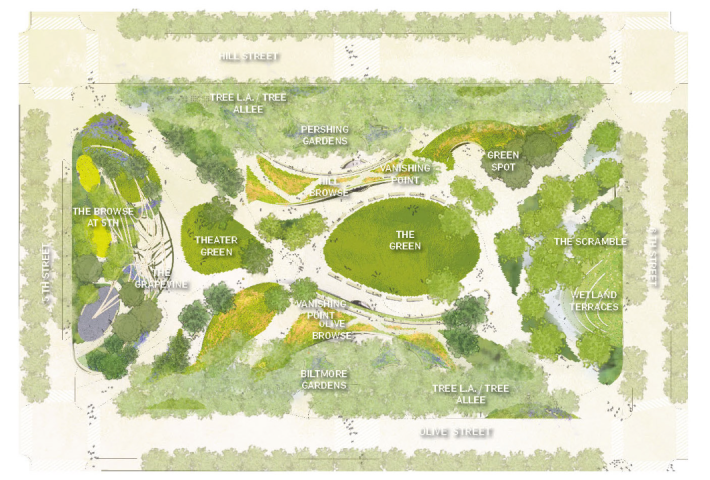
The hilly area of this design is brilliant, and perhaps one of the most inspired single element of all of the designs. It's easy to imagine all sorts of people flocking to the hill to get a view of the rest of the park, and adding different heights is something fun and unexpected. We also suspect it's useful when it comes to the parking garage which is a central component of Pershing Square, something the other designs spend less time thinking about. The version of "Pershing Green" means people will come in droves to this park to play. Is there enough room for the demand this might inspire? The limiting factor of this design is that it's easy to imagine the central green areas as totally overcrowded on a nice day. They seem undersized and boring when compared to the periphery. Another criticism could be that there is too much going on, and the relationship to the city is somewhat fractured.
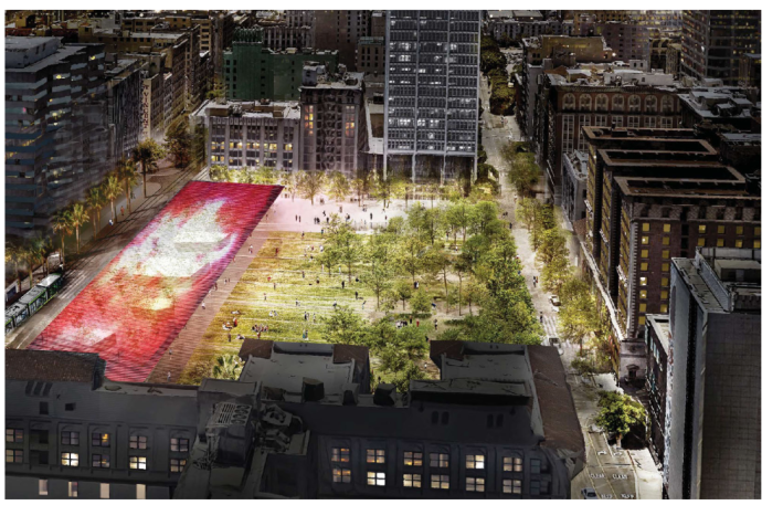
1. James Corner Field Operations with Frederick Fisher and Partners
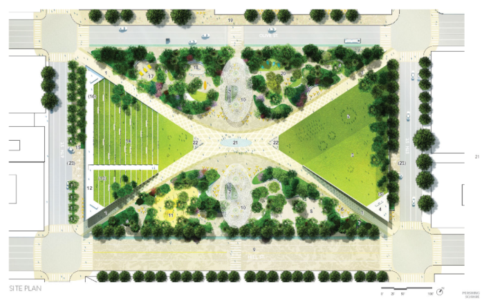
This proposal is our clear favorite for a number of reasons. For one, it is the most formal and classic design. Los Angeles has a reputation as freewheeling and boundary-pushing city, so why should Pershing Square be traditional? Because Los Angeles is also a place where we use what is best in the location without regard to any single set of rules. A Victorian house next to a Craftsman? Why not, if it works? And Pershing Square will work as a traditional park with strong influences of classic parks of Europe. This design does the best job of getting people into the park through its four main channels which converge in a true center. Once they are inside the park, there is a true sense of place. The atmosphere is calm, cool, and reserved, an antidote to the loud and busy city and its rumbling automobiles and construction. It will be a green oasis and features the two largest green spaces of any proposal. The triangular spaces are classically symmetrical, but serve different purposes. Both are easily adapted to various uses and can host innumerable types of gatherings and events. Elevation is used, if not as dramatically as the wHY - Civets design, but in subtle ways that will provide interesting vantage points and needed variety. The shaded areas are the best thought-out of any proposal, and are reminiscent of shaded areas in Paris or Munich. This park is the one that deserves to be the new Pershing Square because it successfully accomplishes everything we are looking for in this urban space, and will be a considered a success both on day one and in one hundred years.

