Every year that the Pantone Color of the Year gets chosen, anyone involved in a visual field either loves it or hates it. For 2016, we got a special treat: two colors instead of one. Rose Quartz and Serenity were named the it-colors for next year, causing an uproar amongst some Internet commenters. The light pastel colors, some argue, look a lot like baby shower colors. Pantone chose the colors with the idea that people wanted something calming, colors that show "connection and wellness as well as a soothing sense of order and peace."
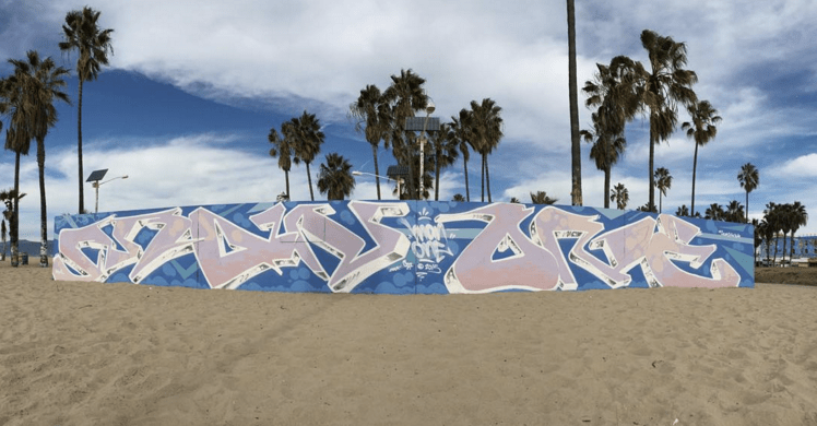
This is the first year that Pantone debuts two colors instead of one. The colors stand on their but also play off each other in marketing materials that Pantone created and in the creative work that has already been made with the hues. Among these: a mural by LA-based Man One at Venice Beach.
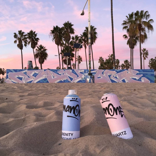
To bring more exposure for the colors, Pantone teamed up with a team of artists to create murals in major cities. The very first mural was created by Man One, a well-known artist in the Los Angeles scene. In his eye-catching, large-scale work, the artist usually makes the most of bold, saturated colors. Each hue is carefully chosen, especially to create drop shadows that give his tags a three-dimensional quality.
The use of pastel colors, then, is uncharacteristic for Man One. But if anyone can infuse baby shower colors with a distinctive edge, it's definitely him.

We can't think of a better location than Venice Beach, too. The iconic spot frames the mural perfectly — in the distance you see palm trees while in the foreground you get the work of a talented artist. Maybe the mural can convince naysayers to see Rose Quartz and Serenity in a new light; if not, then at least we get another great mural near the beach.
